Posted March 24, 2021
WYSIWYG, pronounced [WIZ] + [EE] + [WIG], stands for What You See Is What You Get and is the general text editor used across the site.
This text you are reading right now was added through a WYSIWYG text editor.
The WYSIWYG content block can be added on any post or page by clicking the blue ‘Add Content Block’ button on the bottom in the Content Blocks section and selecting ‘WYSIWYG’.
See the example below.
WYSIWYG Content Block Fields
The WYSIWYG content block has three fields.
- Nav Title is used for in-page navigation. Such as the ‘EXAMPLE’ link in the hero above.
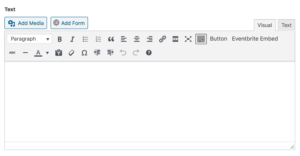
- The Text field is the actual WYSIWYG text editor. Here you have a lot of different options — basic formatting controls to bold, italicize, underline, link or strikeout text as well as more full formatting options like bulleted or numbered lists, blockquotes, images, buttons, EventBrite links, and headers. These are detailed below.
- The Show Sidebar checkbox aligns the WYSIWYG content block to the left of the page (instead of center), allowing the white space to live on the righthand side.
Formatting Options
Add Media: This button invokes an overlay for all available media. You may either select from any files already uploaded to your library (images, documents, galleries, etc.) or you may upload new files from your computer. This will insert the file right into the text editor where your cursor is. From here, click on the image to make alignment and sizing choices — plus you can add captions by clicking the ‘Edit’ icon.

Add Form: This button inserts one of your forms right into the WYSIWYG. However, we recommend using the Form Content Block instead of this option.
Text Style Dropdown:
- Paragraph: This is your default font styling and the main option for your content. This text right here is the default paragraph.
- Heading 1–6: These are great and every author needs to know how to use them. The concept is simple — lower numbers are more important, with Headline 1 being the most important and used for main titles. You can see examples of this hierarchy on our Kitchen Sink page. The specific font choices are made in your Customizer.
- Preformatted: It is intended to display text with white-space preserved, meaning that breaks in the text will be exactly as written. Usually used to display code.
-
Example Here
-
Bold: Highlighted text becomes bold. Such as this example.
Italic: Highlighted text becomes italic. Such as this example.
Bulleted List: Highlighted text will be formatted like a bulleted list.
- This is
- an example of
- a bulleted list.
- Pretty neat.
- Huh?
Numbered List: Similar to above, but with numbers.
- And here is an example
- of a numbered
- list.
- You can add as
- many
- numbers
- as
- you
- want.
- Woo!
Blockquote: Highlighted text will be indicated as a blockquote, which typically means that a whole passage has been quoted from another source.
“This is an example of a blockquote!”
– Lig Team
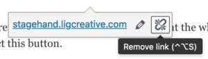
Link (chain icon): The link icon is available for clicking only when text is highlighted. Such as this example.
Unlink (broken chain): To remove a link, an author can highlight the whole link or simply place the cursor within the link and select this button.
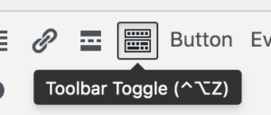
Toggle Toolbar: This button toggles on/off an additional row of options for styling your copy.
***This is an important feature to remember. Sometimes users think that they don’t have full formatting capabilities when they are just hidden.
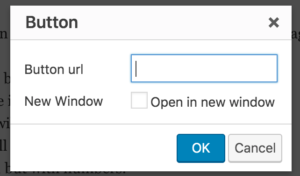
Button: Allows you to add a button anywhere in your text! Type what you want the button to say, highlight the text and click the ‘button’ button. You get a popup with two fields, Button URL and New Window. Button URL is where you’d like the button to link. New Window is for opening the button in a new tab. Example
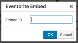 Eventbrite Embed: Highlighted text updates to a button linking to your Eventbrite event. You get a popup with a field, Embed ID. This is where you will place the Eventbrite Event ID. You can learn more about Eventbrite embeds here.
Strikethrough: Highlighted text appears with a line through the center. Such as this example.
Horizontal Rule: Inserts a horizontal rule (a line) between elements.
Paste as Text (clipboard icon): This is an important feature to use if you are copying and pasting content in from external sources. Content from a document, another website, or elsewhere can carry with it invisible formatting that you don’t see. This may conflict with the styling on this site and mess up your layout. To ensure that your content doesn’t hold on to this, click ‘Paste as Plain Text’ before pasting the copy into the text editor.
Clear formatting (eraser icon): This is another important feature to use if you are copying and pasting content in from external sources. If you paste in content and notice that the layout is off, there is likely some formatting that was pulled from the previous source that is conflicting with the site styles. To clear that invisible formatting, highlight the text and click the eraser icon.
Special characters (omega icon): choose from a collection of special characters that you may not be able to access using your keyboard.
Undo/Redo: allows you to easily Undo an action or Redo an action.