dark-attentiondark-datedark-timedark-contactdark-infodark-play dark-pricedark-venueicon-alert icon-arrow-left icon-arrow-right icon-blockquote icon-cal icon-clock icon-contact UI / Full-Part-Volunteer CopyCreated with Sketch. EPS IconCreated with Sketch. icon-facebook--dark_circle icon-facebook--dark_square icon-facebook--outline_circle icon-facebook--outline_square icon-facebookCreated with Sketch. icon-htm icon-info icon-instagram--dark_circle icon-instagram--dark_square icon-instagram--outline_circle icon-instagram--outline_square icon-instagram icon-linkedin--dark_circle icon-linkedin--dark_squareicon-linkedin--outline_circleicon-linkedin--outline_squareicon-linkedin icon-logo2 icon-mp3 icon-pinterest--dark_circle icon-pinterest--dark_square icon-pinterest--outline_circle icon-pinterest--outline_square icon-pinterestCreated with Sketch. icon-play icon-price icon-spotify--dark_circle icon-spotify--dark_square icon-spotify--outline_circle icon-spotify--outline_square icon-spotify icon-spreadsheet icon-threads--dark_circle icon-threads--dark_square icon-threads--outline_circle icon-threads--outline_square icon-threads icon-tiktok--dark_circle icon-tiktok--dark_square icon-tiktok--outline_circle icon-tiktok--outline_square icon-tiktok icon-twitter--dark_circle icon-twitter--dark_square icon-twitter--outline_circle icon-twitter--outline_square icon-twitterCreated with Sketch. icon-x--dark_circle icon-x--dark_square icon-x--outline_circle icon-x--outline_square icon-x icon-youtube--dark_circle icon-youtube--dark_square icon-youtube--outline_circle icon-youtube--outline_square icon-youtubeCreated with Sketch. FolderCreated with Sketch. icon-zoom light-attentionlight-cal light-clocklight-contactlight-infolight-play light-pricelight-venue

Testimonial Content Block

The Testimonial content block can be added on any post or page by clicking the blue ‘Add Content Block’ button on the bottom in the Content Blocks section and selecting ‘Testimonial’.

See the example below.

Testimonial Content Block Fields

This content block has seven fields.

Nav Title is used for in-page navigation. Such as the ‘EXAMPLE’ link in the hero above.

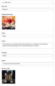
The Background Image is used as the background for the full block. There is a color overlay built into the block to ensure text legibility and is set at the Primary Color, which is chosen in the Customizer.

The Name field is the name of the person (or droid) that is being quoted.

The Quote field is the quote that you are highlighting. Do not include quotes in this field.

The Location field appears after the Name Field. This can indicate where the quoted person is located or it can be used for different information that is relevant to your users — perhaps title or age.

The Detail field is another option for additional information about the quoted person and appears below the Name, Location line.

The last field is the Person Image to include a headshot of the quoted person or other optional image. Be ware that this appears as a thumbnail size, so you’ll want to select a photo that isn’t too small or far away.


Make sure to ‘Update’ the page to save your changes.

Brightly painted brick wall

This testimonial content block has been perfect for my website. I am extremely pleased with the aesthetics of this informative block of content.

Headshot Image for R2D2
R2D2, Naboo A resourceful astromech droid


Training video to come.