Posted April 10, 2021
The Column Blocks content block can be added on any post or page by clicking the blue ‘Add Content Block’ button on the bottom in the Content Blocks section and selecting ‘Column Blocks’.
See the example below.
Column Blocks Content Block Fields
This content block is one of the most flexible, made to fit a wide variety of content. It has five fields to adjust layout and enter content.
Nav Title is used for in-page navigation, allowing a user to jump down to specific content easily. This is the ‘EXAMPLE’ link in the hero above.
The Title field is for the content block header, such as the ‘Column Blocks Title’ below. The Intro Text field is for ancillary information under the title for more context for users.
The Column Number field is the number of columns per row. You have the option of choosing 1 through 5. If you have more blocks than the chosen number, they’ll just push to the next line. For example, if you have 10 blocks total, you most likely want 5 columns per row that will result in 2 rows.
The Block field is a special field type called a repeater where your actual content will live. You add/repeat as many ‘Blocks’ as you would like. Click the blue ‘Add Block’ button and a series of fields will appear. All fields are optional and the block style will adjust accordingly.
- Title is the bolded text that shows at the top of a block.
- Graphic Type gives you the option of choosing ‘photo’ or ‘icon’. Both appear on the top of the block. The difference here is that the ‘icon’ option will add padding around the image while the ‘photo’ option will extend all the way to the edges. (See example below.)
- The Graphic field is to upload the image or icon you wish to show.
- The Description is the main text content of a block with full WYSIWYG capabilities.
- The Button Text field only needs to be filled out if you wish to add a button to the bottom of the block. If you leave this empty, nothing will show.
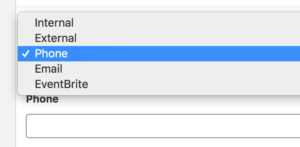 The Button Type field gives you several link options: Internal, External, Phone, Email or Eventbrite. Depending on what you choose, another field will appear below for you to insert the corresponding information. For example, in this screenshot ‘Phone’ is selected and a Phone field appeared below.
Make sure to ‘Update’ the page to save your changes.
