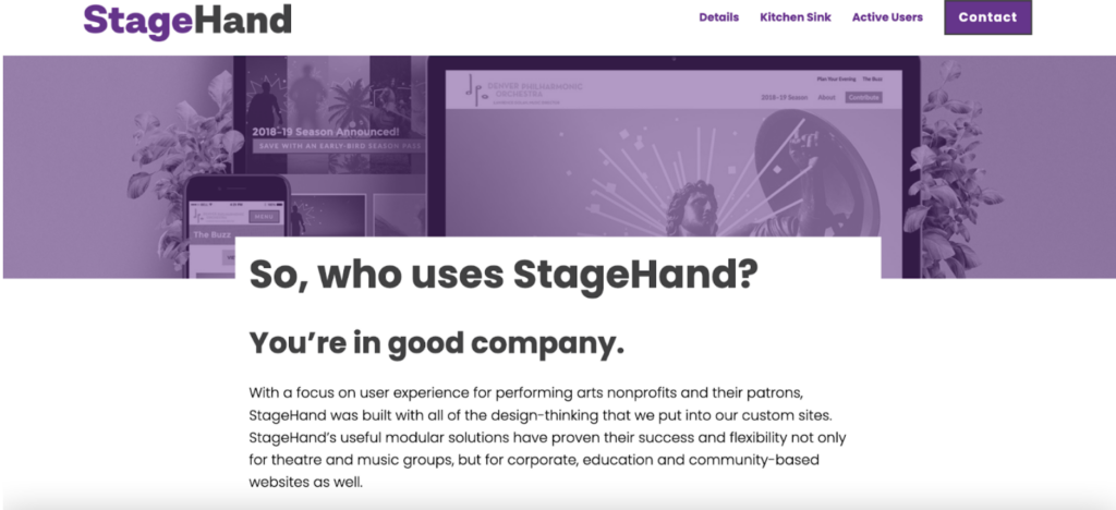
Accessible Hero Options
Step 1. Navigate to the ‘Options’ tab in the left-hand menu, then click ‘Accessibility.’

Step 2. You’ll notice two different options are available: ‘Accessible’ and ‘Less Accessible.’

Step 3. Selecting the ‘Accessible’ option will do the following:
- Insert the homepage hero text in a white box that provides greater contrast over the hero image. The latest accessibility standards discourage text over images.

- Selecting the ‘Accessible’ option will also give you the option to select how the featured image and header text will display on interior pages. You’ll have the following two options: ‘Featured Image, title in White Box’ and ‘No featured Image, white title on primary color background.’

Step 4. ‘Featured Image, title in White Box’ will insert the interior page hero text in a white box that provides greater contrast over the featured image.

Step 5. ‘No featured Image, white title on primary color background’ will remove the featured image and use your site’s primary color* as the background for white header text. The remaining hero text will be pushed underneath the hero section.

Step 6. Don’t forget to click ‘Update’ every time you make a change! It’s also important to note that your website settings are currently defaulted to the ‘Less Accessible’ option. That is to say, the new accessibility updates won’t take effect without your manual intervention.
Note: As a reminder, your primary colors can be customized in the ‘Customize’ tool, which can be accessed on the site’s frontend when you’re logged in.

Once in the Customizer tool, click on the ‘Colors’ tab to view your site’s color palette.


For best accessibility practices, please reference the Web AIM Contrast Checker. Ensure that your Primary Color and Primary Dark Color pass WCAG AA for both “Normal Text” and “Large Text” when paired with white (#FFFFFF). You’ll see a green “Pass” or red “Fail.” Questions about contrast ratios? Please don’t hesitate to reach out for help!

You can also center or left align your heroes in the customizer.
Note: If you choose the ‘Featured Image, title in White Box’ option, the title will be automatically center-aligned.

